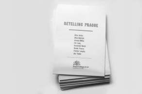
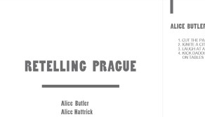
Retelling Prague | publication design, print
Design & Art Direction for Critical Writing, Royal College of Art
200 copies, A5 unfolds into A2
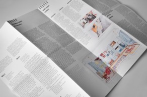
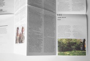
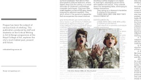
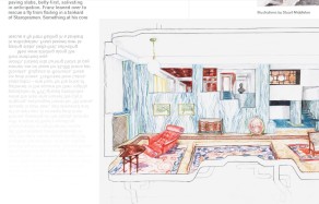
Working closely with the writer this publication composes texts on various aspects of Prague from multitude of perspectives by a range of writers. The headline typeface (Poplar) was used for its slightly rounded detail and full body, resembling the old wood carvings and also letters from the story telling books. Poplar as a headline font brings clarity and at the same time indicates the 'tale' character of the texts, thought provoking texts. I used Gothic720BT font for body copy as if to paint Prague's urban scape in the background.
The publication at first seems rather fragmented as it fits all texts of different structure and length, but each chapter has a dedicate amount of orderly lines to indicate which one it is and where it starts. Besides the intricate Czech names' spelling in the credits the overall layout focuses on the nature of the texts and allows individual layout shift accordingly within the outlined grid. So although this is based on a traditional grid it becomes a platform for play and light hearted improvisation of paragraphs of text (sometimes it beings reflected and repeated) to facilitate the overall experimental nature of the texts.