


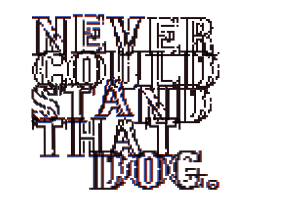

Typography inspired by London
Part of the lyrics from the song Finisterre by Saint Etienne
Designed for Emerge, the best of design graduates show
Judged by Domenic Lippa (Pentagram)
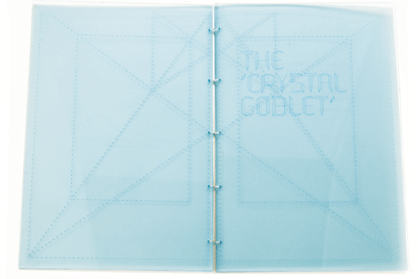
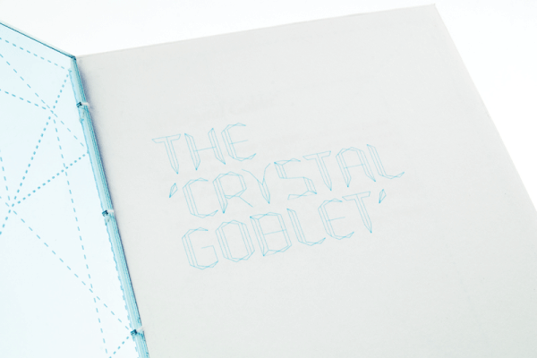
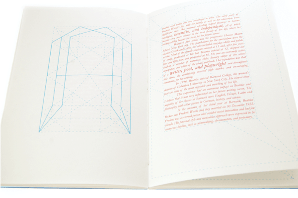
The Crystal Goblet Typeface
The Crystal Goblet typeface design is based on the 'Golden Section', a grid traditionally used for book design due of its most pleasing proportions. Using the grid as a starting point, type shapes into a new visual form dictated by the new space characteristics and what it allows.
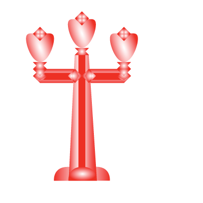
The title of the type is based on the characteristics of the typeface and also refers to a famous essay written by Beatrice Warde in 1956 called "The Crystal Goblet, or Printing Should Be Invisible".
The Crystal Goblet Typeface
The Crystal Goblet typeface design is based on the 'Golden Section', a grid traditionally used for book design due of its most pleasing proportions. Using the grid as a starting point, type shapes into a new visual form dictated by the new space characteristics and what it allows.
The title of the type is based on the characteristics of the typeface and also refers to a famous essay written by Beatrice Warde in 1956 called "The Crystal Goblet, or Printing Should Be Invisible".
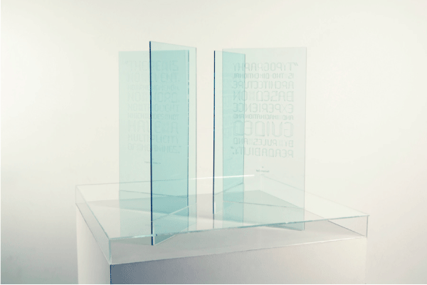
The Crystal Goblet Typeface
Type laser engraved on transparent sheets, placed in a circle, creating a dialogue of the four quotes used for each sheet to showcase the new typeface.
The Crystal Goblet typeface design is based on the 'Golden Section', a grid traditionally used for book design due of its most pleasing proportions. Using the grid as a starting point, type shapes into a new visual form dictated by the new space characteristics and what it allows.
The title of the type is based on the characteristics of the typeface and also refers to a famous essay written by Beatrice Warde in 1956 called "The Crystal Goblet, or Printing Should Be Invisible".
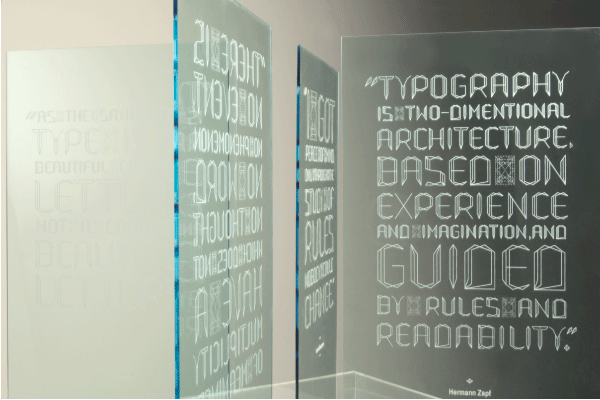
The Crystal Goblet Typeface
Type laser engraved on transparent sheets, placed in a circle, creating a dialogue of the four quotes used for each sheet to showcase the new typeface.
The Crystal Goblet typeface design is based on the 'Golden Section', a grid traditionally used for book design due of its most pleasing proportions. Using the grid as a starting point, type shapes into a new visual form dictated by the new space characteristics and what it allows.
The title of the type is based on the characteristics of the typeface and also refers to a famous essay written by Beatrice Warde in 1956 called "The Crystal Goblet, or Printing Should Be Invisible".
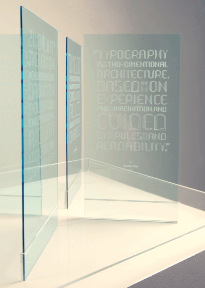
The Crystal Goblet Typeface
Type laser engraved on transparent sheets, placed in a circle, creating a dialogue of the four quotes used for each sheet to showcase the new typeface.
The Crystal Goblet typeface design is based on the 'Golden Section', a grid traditionally used for book design due of its most pleasing proportions. Using the grid as a starting point, type shapes into a new visual form dictated by the new space characteristics and what it allows.
The title of the type is based on the characteristics of the typeface and also refers to a famous essay written by Beatrice Warde in 1956 called "The Crystal Goblet, or Printing Should Be Invisible".
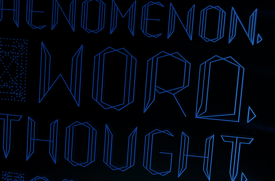
The Crystal Goblet Typeface
Type laser engraved on a transparent sheet, this is a documentation of an interactive poster used to showcase the new typeface. The light was activated in the dark using wires and Arduino. Only possible and complete with the help of Adrian McEwen.
The Crystal Goblet typeface design is based on the 'Golden Section', a grid traditionally used for book design due of its most pleasing proportions. Using the grid as a starting point, type shapes into a new visual form dictated by the new space characteristics and what it allows.
The title of the type is based on the characteristics of the typeface and also refers to a famous essay written by Beatrice Warde in 1956 called "The Crystal Goblet, or Printing Should Be Invisible".
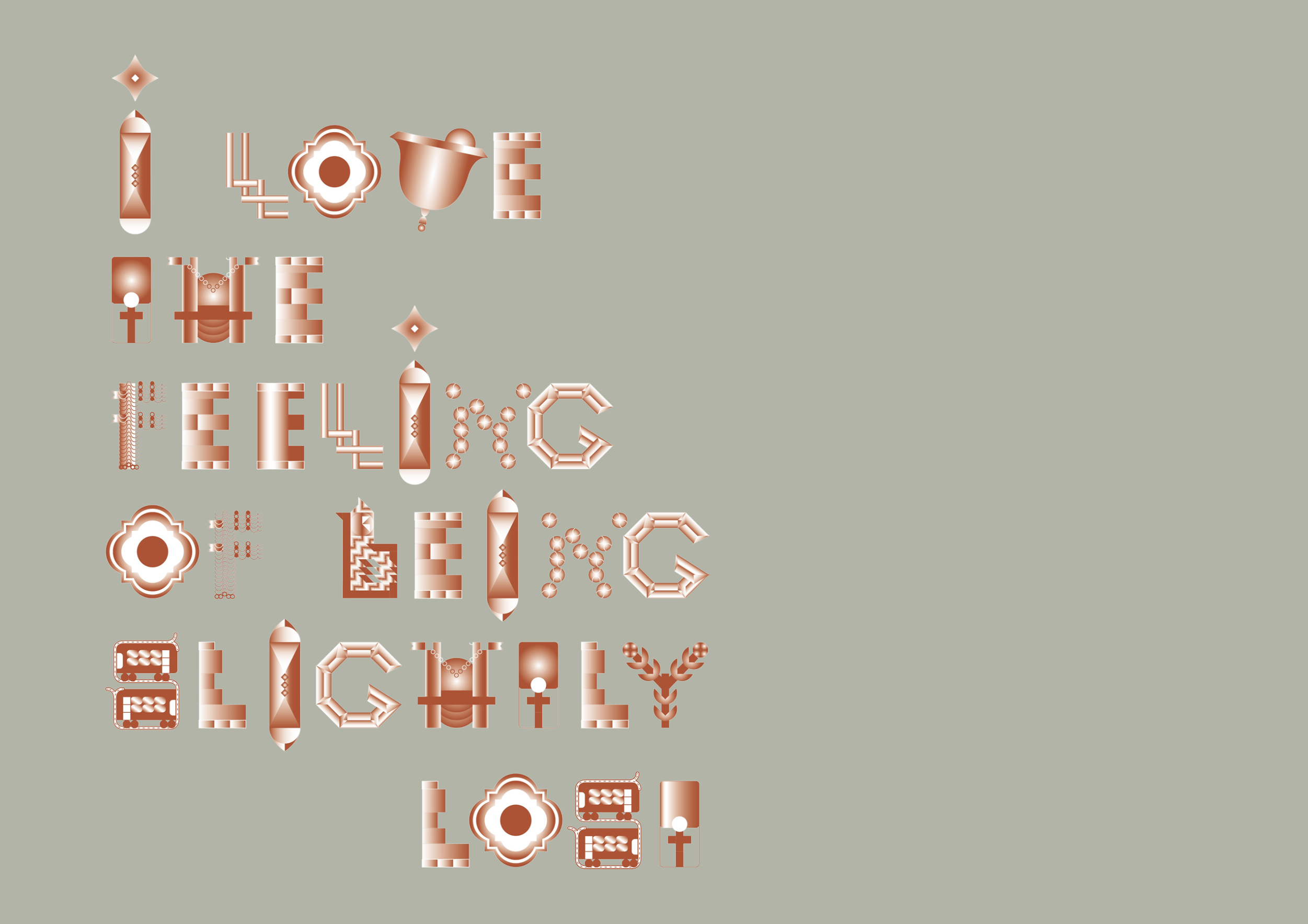
"I love the feeling of being slightly lost" Lettering
A3 poster design in response to the brief set by Dominic Lippa (Pentagram, London)
Designed for Emerge, an exhibition showcasing the best of graphic design graduates, part of London Design Festival, 2011
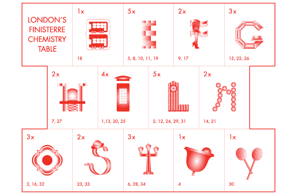
There is some kind of London chemistry in the air that attracts people to come here... Poster works as a London chemistry table. The decoded sentence is the title of the Typeface. It reads: ''I love the feeling of being slightly lost'', which is the line from the lyrics of a London based music band, St Etienne, from their song (also !) about London.
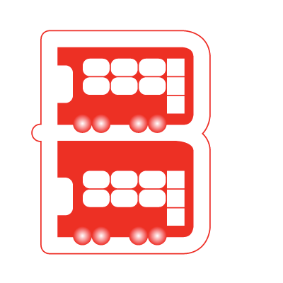
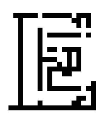
B from "I love the feeling of being slightly lost" Lettering
A3 poster design in response to the brief set by Dominic Lippa (Pentagram, London)
Designed for Emerge, an exhibition showcasing the best of graphic design graduates, part of London Design Festival, 2011
There is some kind of London chemistry in the air that attracts people to come here... Poster works as a London chemistry table. The decoded sentence is the title of the Typeface. It reads: ''I love the feeling of being slightly lost'', which is the line from the lyrics of a London based music band, St Etienne, from their song (also !) about London.
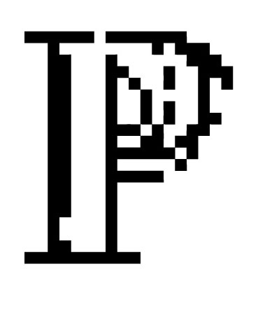
F from "I love the feeling of being slightly lost" Lettering
A3 poster design in response to the brief set by Dominic Lippa (Pentagram, London)
Designed for Emerge, an exhibition showcasing the best of graphic design graduates, part of London Design Festival, 2011
There is some kind of London chemistry in the air that attracts people to come here... Poster works as a London chemistry table. The decoded sentence is the title of the Typeface. It reads: ''I love the feeling of being slightly lost'', which is the line from the lyrics of a London based music band, St Etienne, from their song (also !) about London.
G from "I love the feeling of being slightly lost" Lettering
A3 poster design in response to the brief set by Dominic Lippa (Pentagram, London)
Designed for Emerge, an exhibition showcasing the best of graphic design graduates, part of London Design Festival, 2011
There is some kind of London chemistry in the air that attracts people to come here... Poster works as a London chemistry table. The decoded sentence is the title of the Typeface. It reads: ''I love the feeling of being slightly lost'', which is the line from the lyrics of a London based music band, St Etienne, from their song (also !) about London.
S from "I love the feeling of being slightly lost" Lettering
A3 poster design in response to the brief set by Dominic Lippa (Pentagram, London)
Designed for Emerge, an exhibition showcasing the best of graphic design graduates, part of London Design Festival, 2011
There is some kind of London chemistry in the air that attracts people to come here... Poster works as a London chemistry table. The decoded sentence is the title of the Typeface. It reads: ''I love the feeling of being slightly lost'', which is the line from the lyrics of a London based music band, St Etienne, from their song (also !) about London.
T from "I love the feeling of being slightly lost" Lettering
A3 poster design in response to the brief set by Dominic Lippa (Pentagram, London)
Designed for Emerge, an exhibition showcasing the best of graphic design graduates, part of London Design Festival, 2011
There is some kind of London chemistry in the air that attracts people to come here... Poster works as a London chemistry table. The decoded sentence is the title of the Typeface. It reads: ''I love the feeling of being slightly lost'', which is the line from the lyrics of a London based music band, St Etienne, from their song (also !) about London.
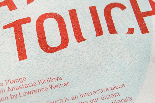
Exhibition hand-out, Letters from dew: please stay in touch
100 A4 size Riso printed leaflets accompanied my interactive installation piece: leaflet design, custom lettering
Sustain RCA Show & Awards yearly celebrates the best sustainable projects
Exhibition hand out design A4 Risograph prints by Ditto Press on natural white paper
Video documentation of the exhibition here
Detail, Exhibition hand-out, Letters from dew: please stay in touch
100 A4 size Riso printed leaflets accompanied my interactive installation piece: leaflet design, custom lettering
Sustain RCA Show & Awards yearly celebrates the best sustainable projects
Exhibition hand out design A4 Risograph prints by Ditto Press on natural white paper
Video documentation of the exhibition here
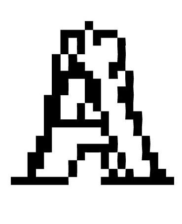
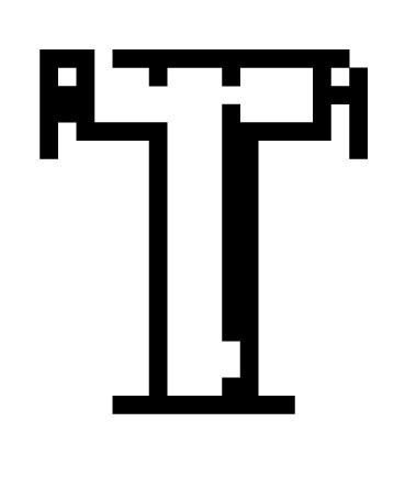
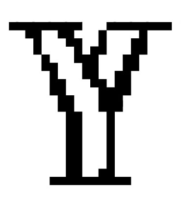
Typenoid, screen-printed digital lettering
A-Z letter design Typenoid (type no ID) is a combination of literally overlapping two key fonts: serif and non-serif.
Inspired by the piece Frank's Wild Years recorded by Tom Waits from the album Swordfishtrombones which came out in 1983, the time when the digital era was just about to kick off...
Typenoid, digital lettering
A-Z letter design Typenoid (type no ID) is a combination of literally overlapping two key fonts: serif and non-serif.
Inspired by the piece Frank's Wild Years recorded by Tom Waits from the album Swordfishtrombones which came out in 1983, the time when the digital era was just about to kick off...
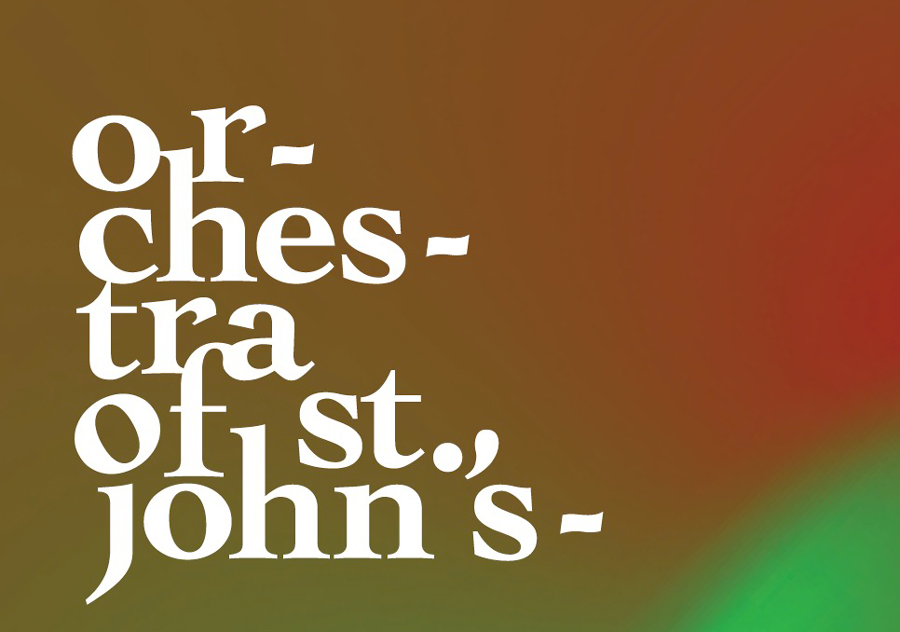
Detail, poster design, John Lubbock Orchestra
Headline lettering for John Lubbock's Orchestra Classical music event poster.
Cochin typeface, originally designed in 1913, based on Nicolas Cochin’s eighteenth century engravings. I appreciate the characteristics and history that lies behind this expressive font yet it is flamboyant enough to visually bring us back to the current day of 'we want fun' audience.
Detail, exhibition headline, Materials for Living
For Associate Parliamentary Design and Innovation Group (APDIG) is concerned with creative industries issues related to design & innovation exhibition design displayed at Parliament’s Upper Westminster Gallery.
Exhibition main headline design done using geometric lettering inspired by the different people bringing their innovative work to display.
Exhibition material design fitted in the space with only free-standing display stands; all design includes main exhibition title, poster and info panel designs
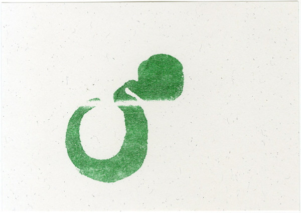
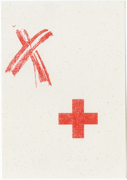
Postcard, Risograph print
Self promotion postcard
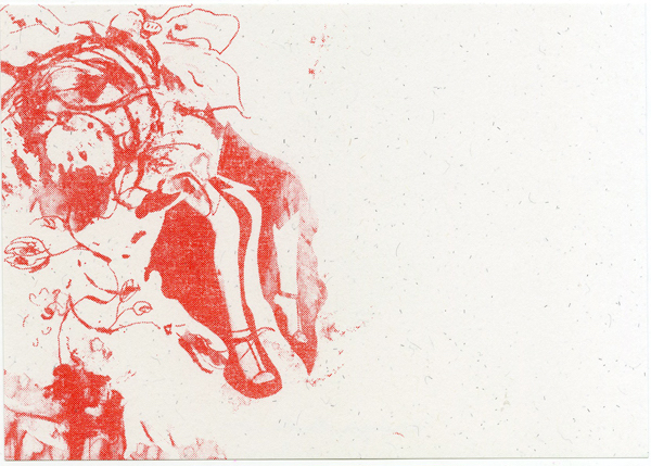
Postcard, Risograph print
Self promotion postcard
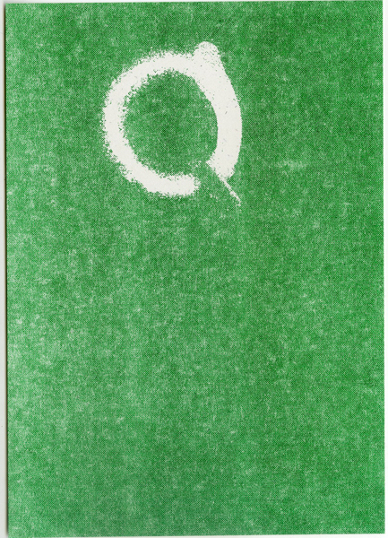
Postcard, Risograph print
Self promotion postcard
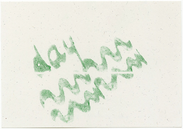
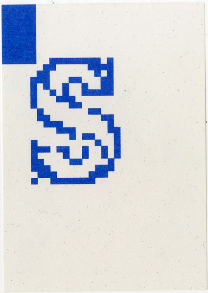
Postcard, Risograph print
Self promotion postcard
Postcard, Risograph print
Self promotion postcard
Postcard, Risograph print
Self promotion postcard
Postcard, Risograph print
Self promotion postcard
Postcard, Risograph print
Self promotion postcard
Postcard, Risograph print
Self promotion postcard