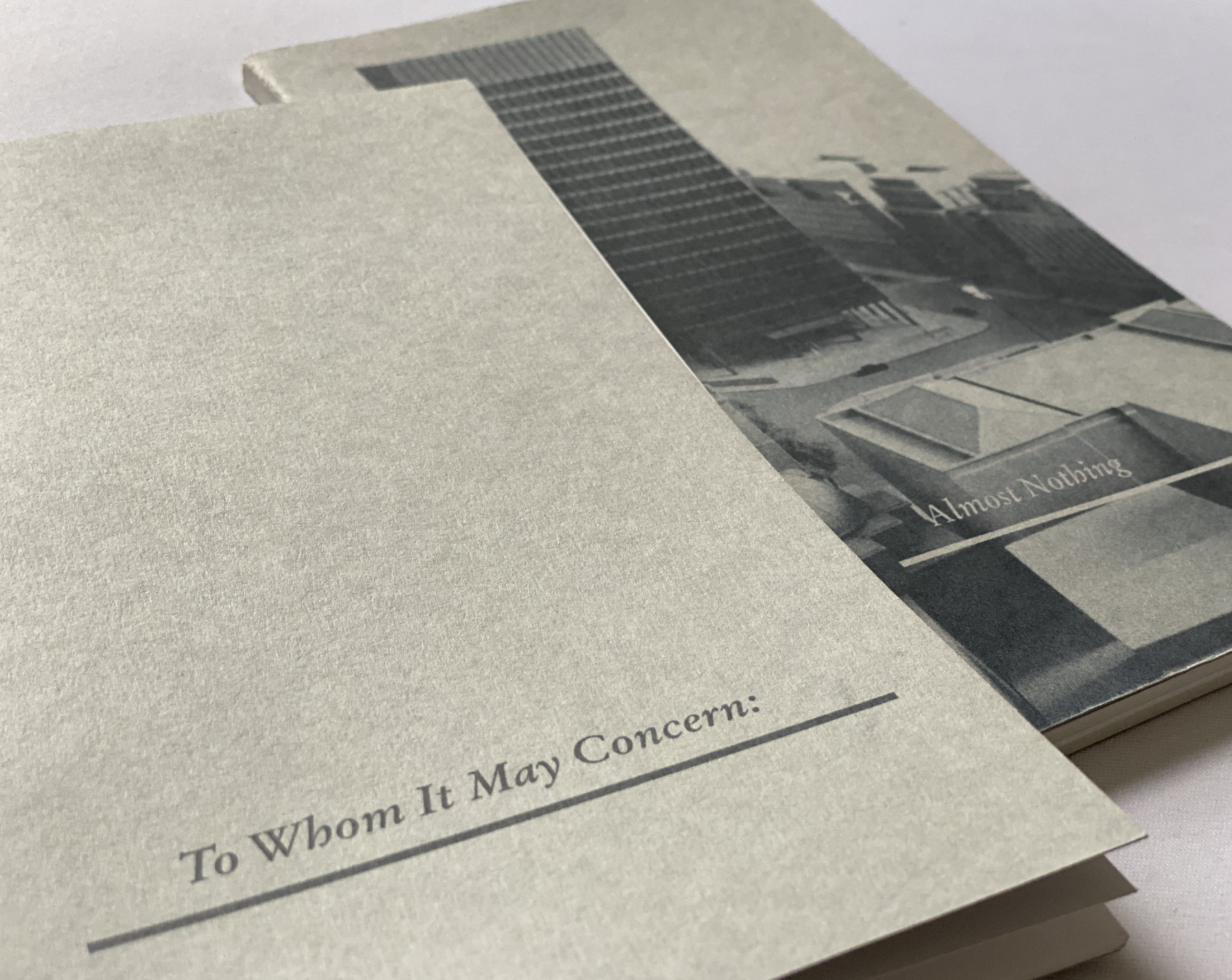
To Whom It May Concern / Almost Nothing
94 pages /124 pages, 5 copies each,
140 x 230mm, perfect-bind, each hand made
Dreadnaught Grey (Canford Card) by Daler Rowney (cover)
“A particularly engaging collaboration ...
Maxwell’s bravura discourse — his “critical fiction” tries to write the phantom building into being — gains added authority from perfectly measured columns of professional-looking type and a smoothly integrated picture section that meets the layout standards of
an architectural monograph.”
– Rick Poynor, Design Critic
To Whom It May Concern / Almost Nothing (detail)
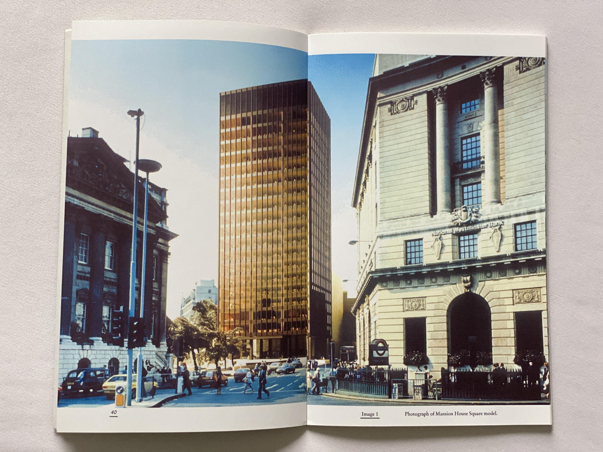
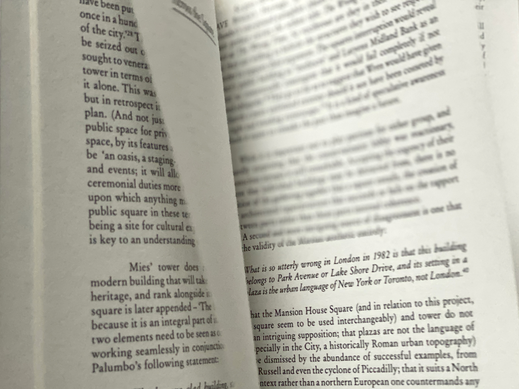
Publications are about Mies van der Rohe’s unrealized proposal for the Mansion House Square building in London.
To Whom It May Concern / Almost Nothing (detail)
Publications are about Mies van der Rohe’s unrealized proposal for the Mansion House Square building in London.
To Whom It May Concern / Almost Nothing (detail)
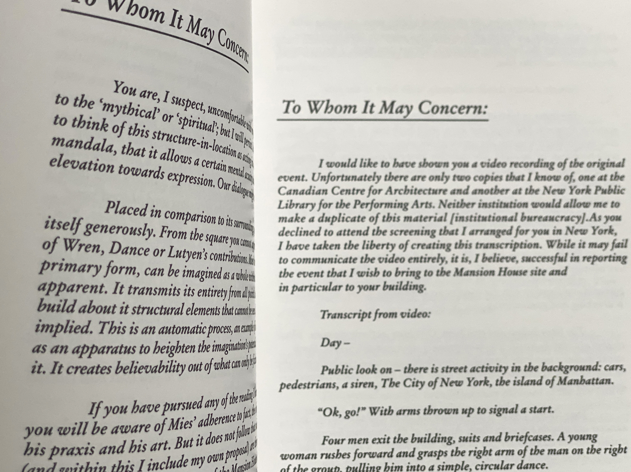
Context Natural (100gsm) by Paperback Ltd (essay section)
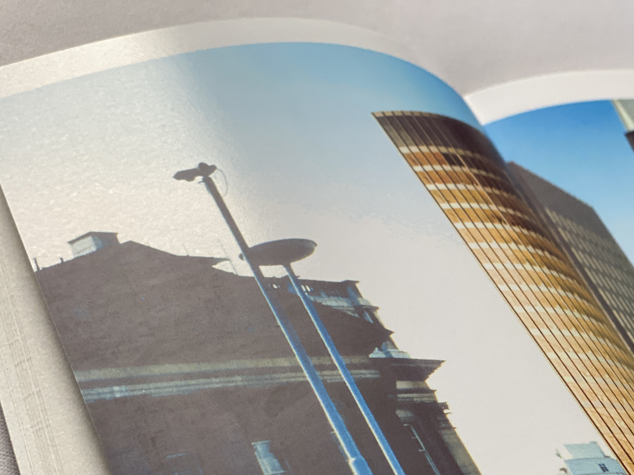
Gloss Finish (130gsm) Laser printer paper (image section)
To Whom It May Concern / Almost Nothing (detail)
The textural detail of mixed matt and gloss finish paper creates a seriously convincing case for the fictitious letters.
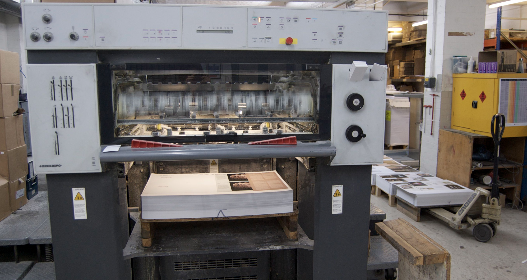
Humancraft, printing process at Calverts
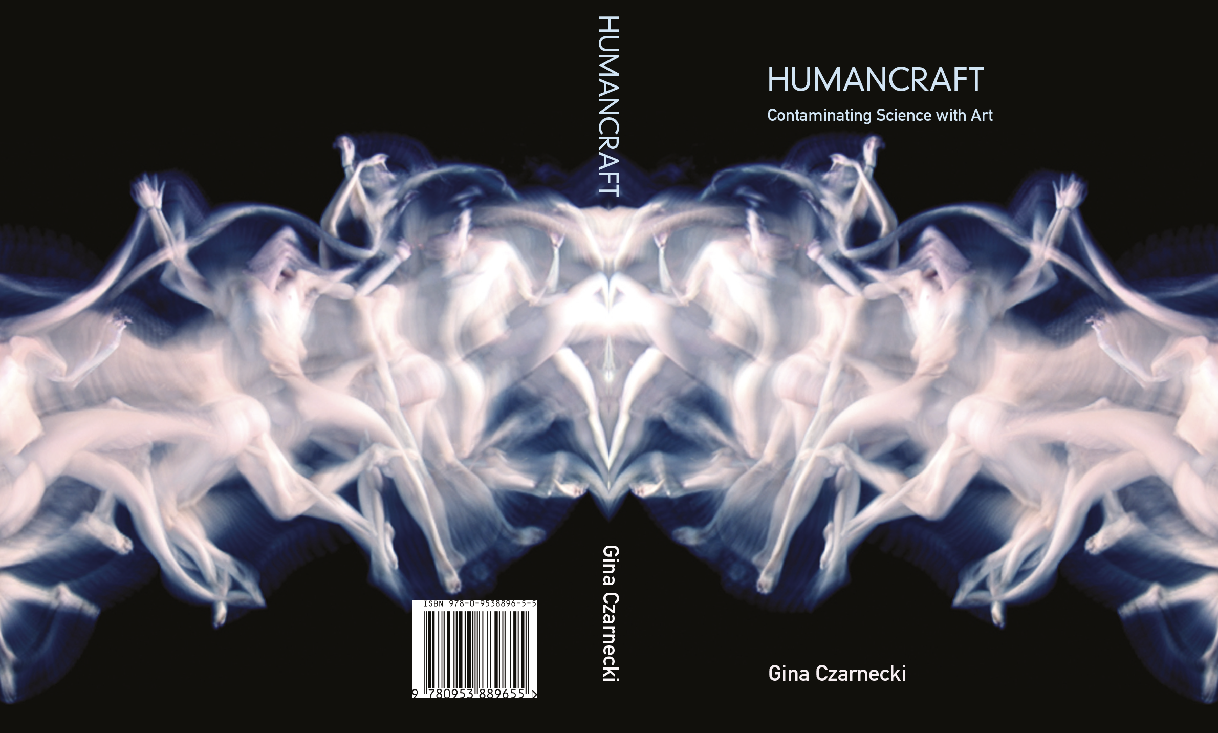
Humancraft
100 pages, 400 copies
210 x 170mm, perfect bind, Litho printing
Gloss spot UV (over images of bodies only) on front, back and spine
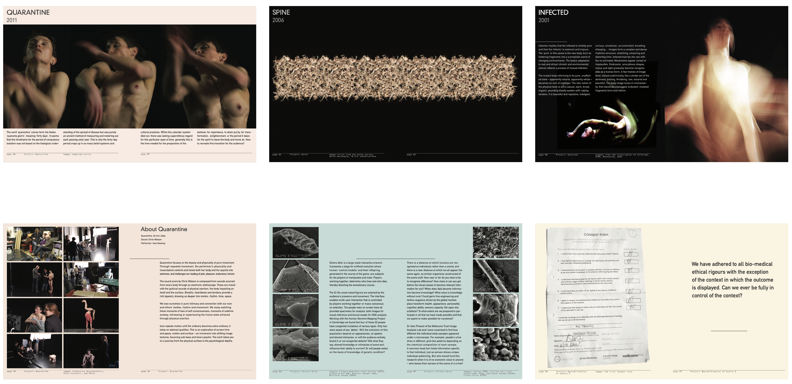
Humancraft (detail)
Working closely with the Bluecoat Gallery’s (Liverpool) Curator Sara-Jayne Parsons and Artist herself. Publication compiled years of chapters of scientific research, artwork documentation and artist essays by using a simplistic dynamic layout which allows to echo and visually ‘frame’ the subject – the human.
Company reports
~100 pages, A4 each
Digital PDF’s, print-on-demand
One of many miscellaneous in-house publications
Strictly in line with the branding designed by Neville Brody
and his consultancy, Research Studios
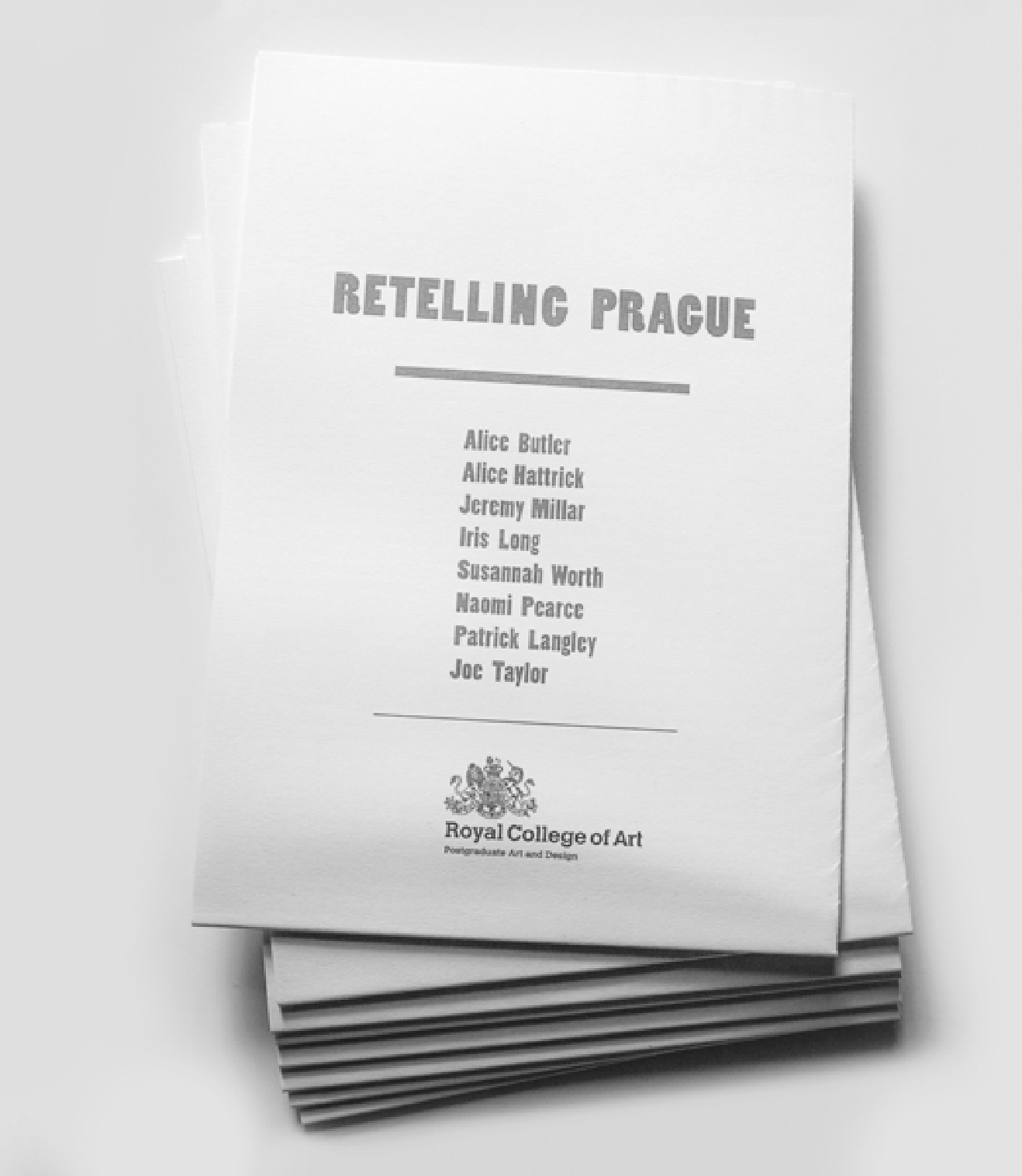
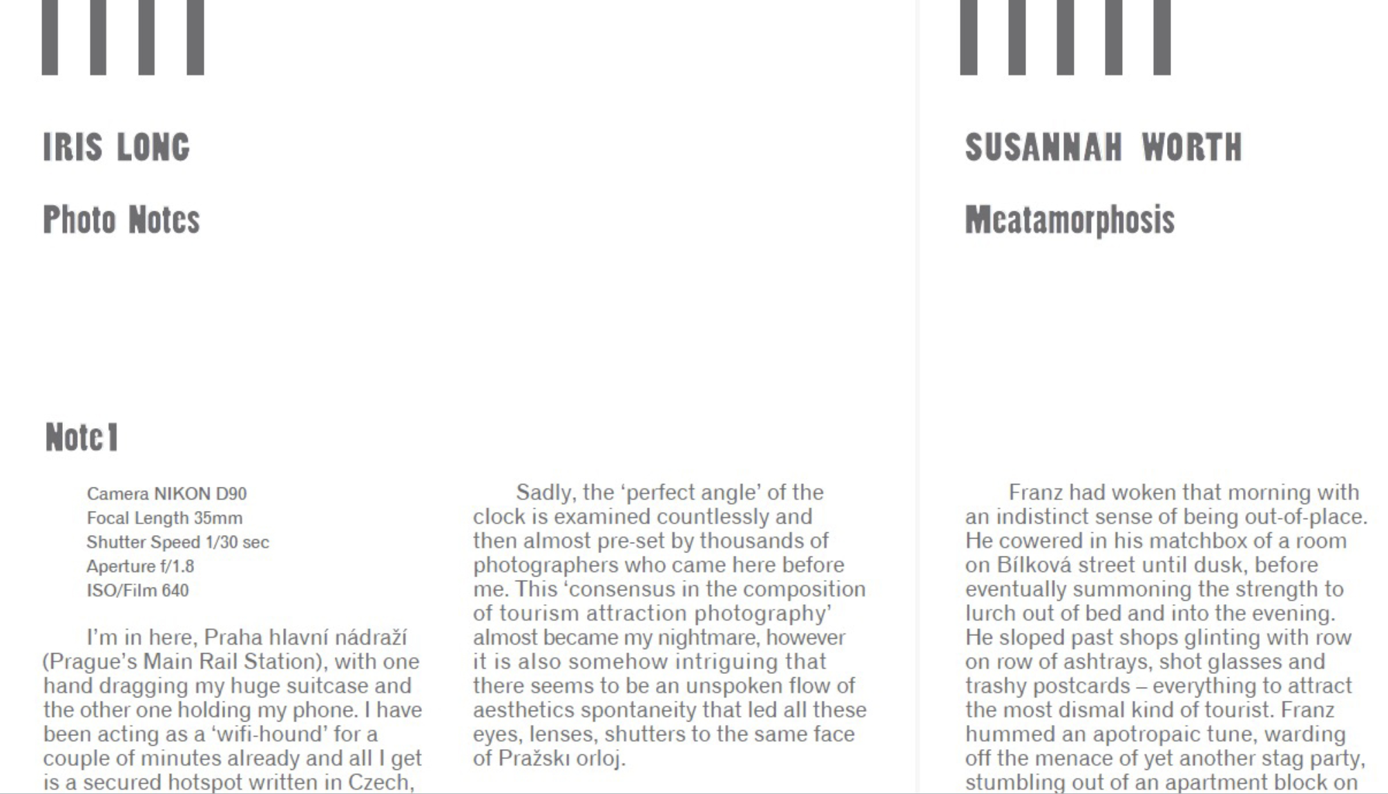
Retelling Prague
Double sided A2 folded to A5, 200 copies
Full colour digital print
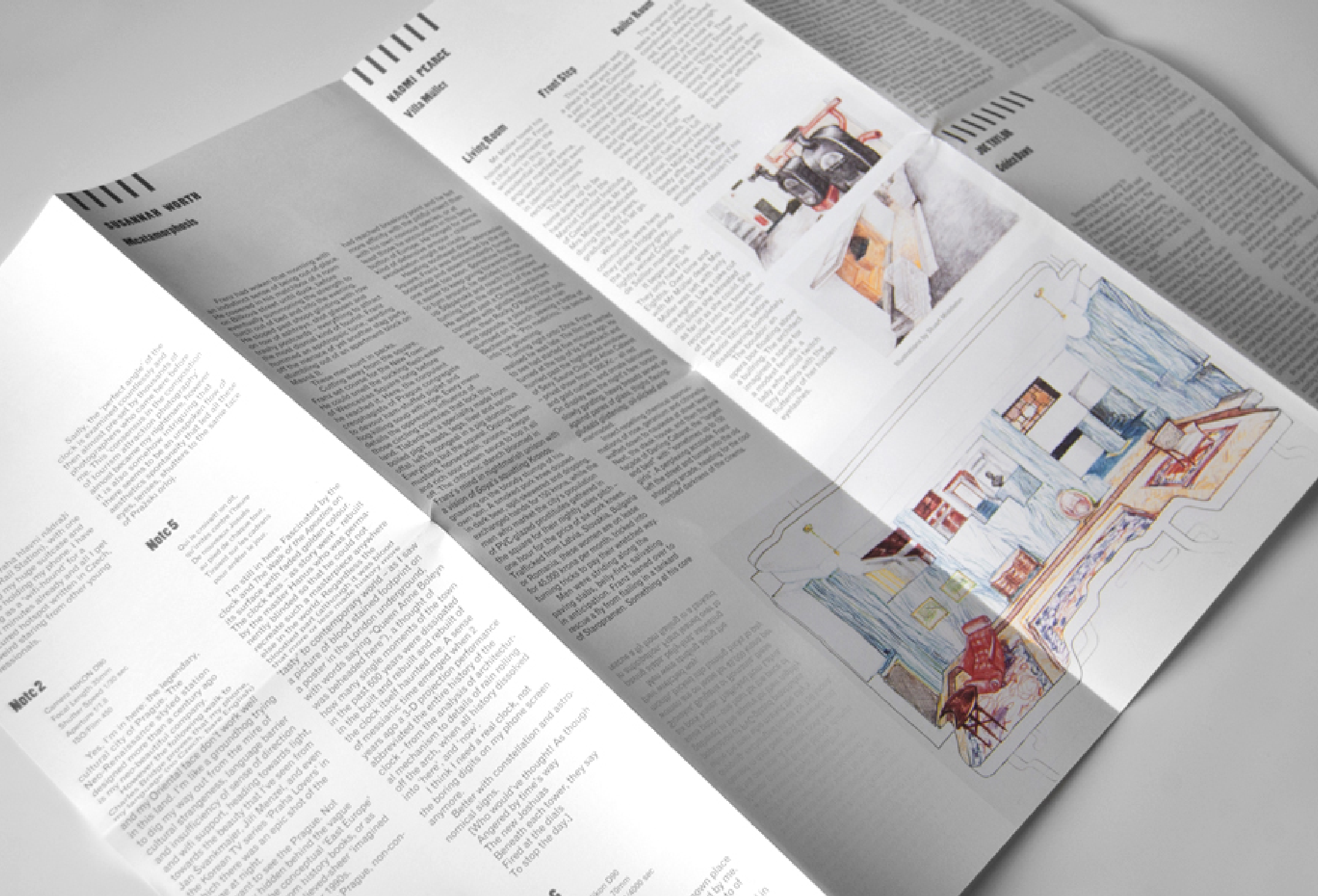
Retelling Prague (detail)
Double sided A2 folded to A5, 200 copies
Full colour digital print
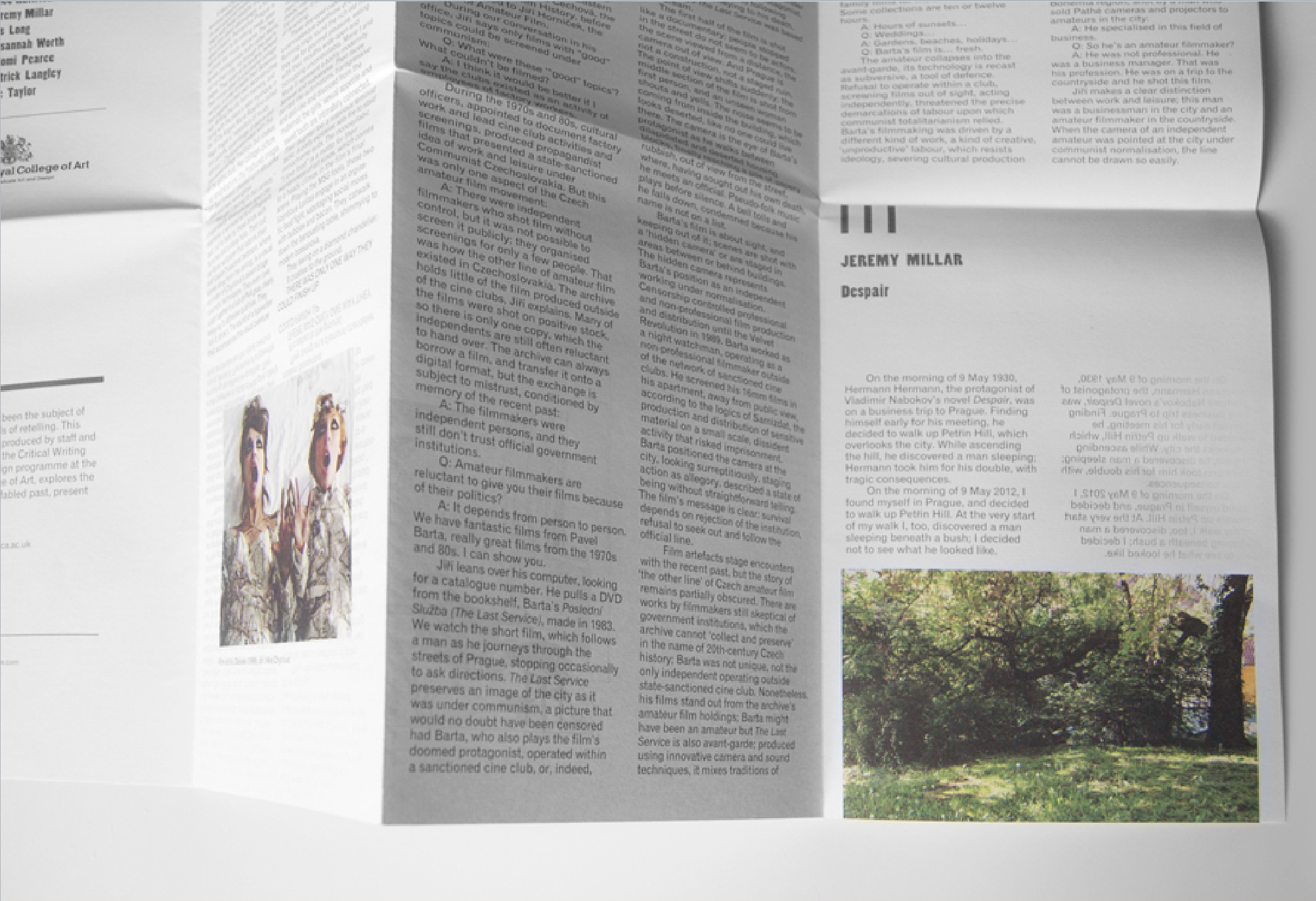
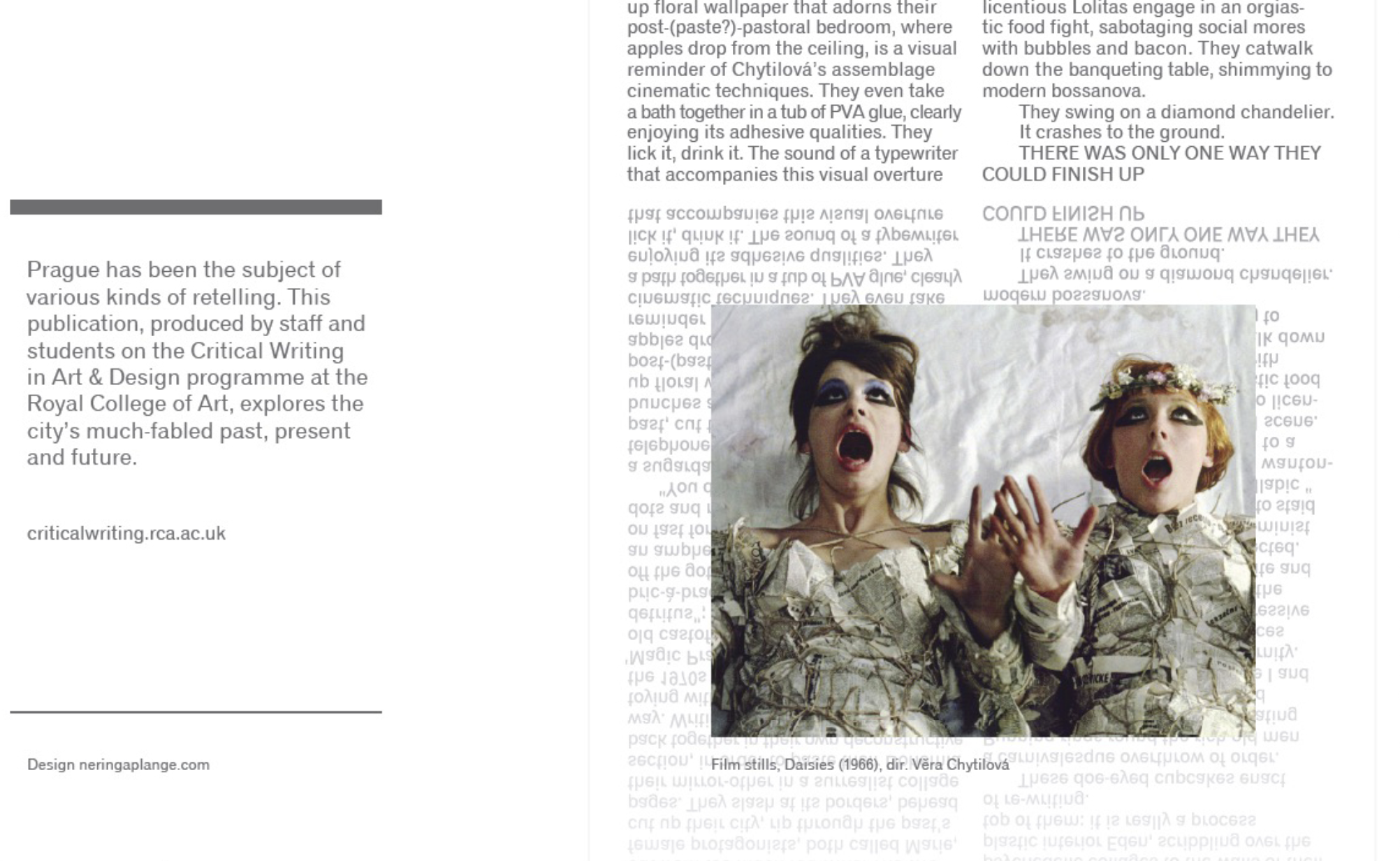
Retelling Prague (detail)
Mirrored and fading type treatment gently echoes the concept of the young writers’ reflection on the city of Prague.
Semi-playful layout with the classically laid paragraph text
(left aligned) leads the reader on a thought adventure.
Chapters are introduced with bold lines rather than numbers to graphically further draw the readers in, ‘signaling’ a sense of a bleak yet unique city.
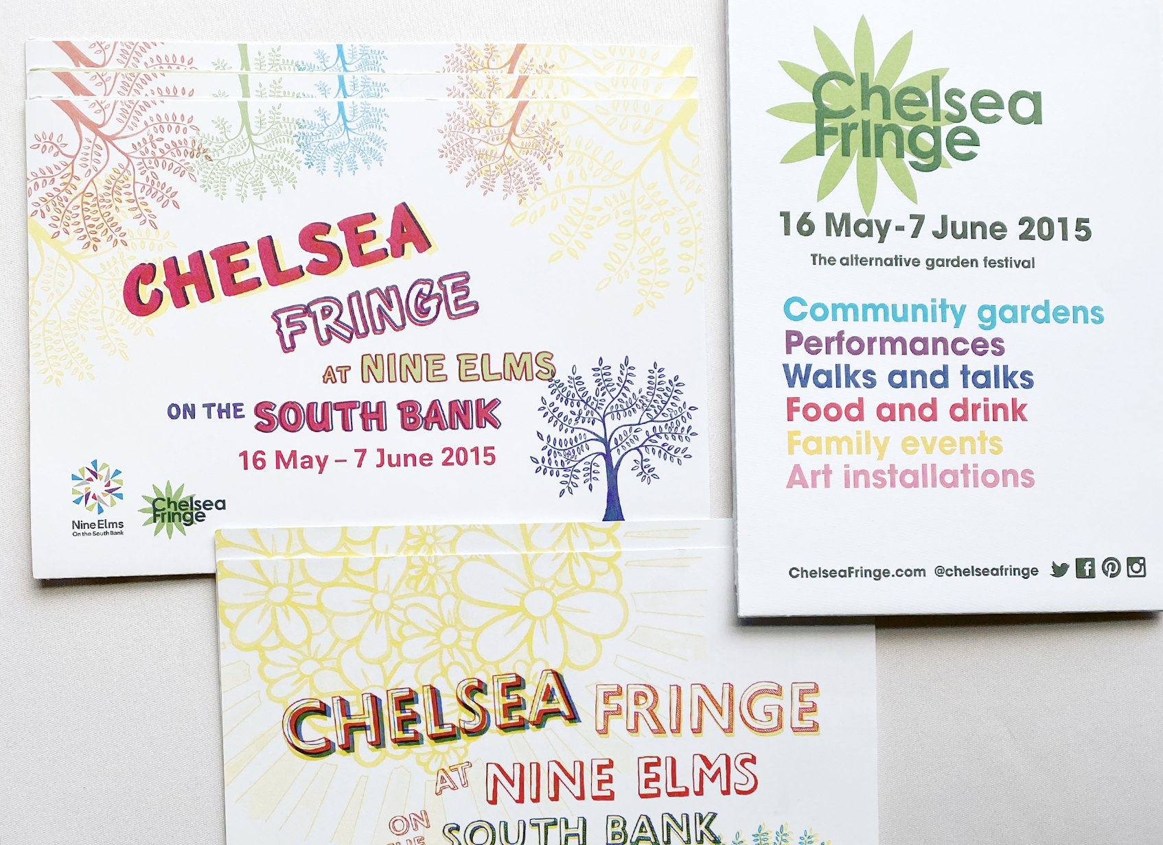
Public event programmes
~18000 copies
A3 or A2, each folds into A5
Double sided Litho prints
Public event programmes (side one)
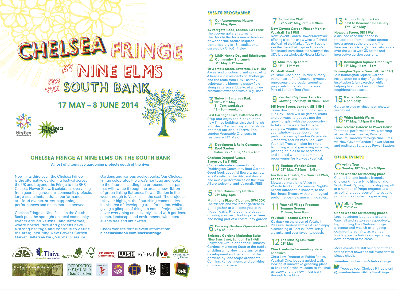
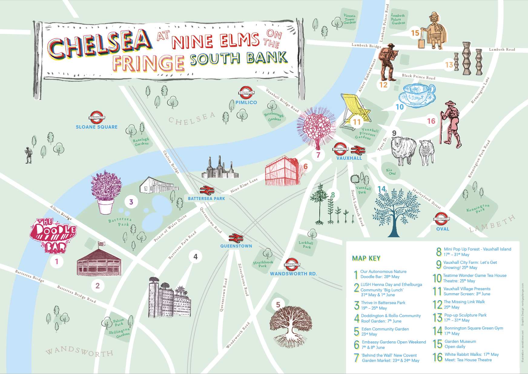
A mix of fun hand written typography along with functional clear type layout for family friendly events across London
Public event programmes (side two)
Illustrations by Sam Skinner, street artist @fig_oxford project
